The Origins of Flat Design: From Skeuomorphism to Minimalism
The Skeuomorphic Era: When UI Mimicked the Real World
Before the minimalist design trend dominated the digital world, early interface designs were filled with skeuomorphic elements. You’ve probably seen digital buttons that looked like physical ones or a calendar icon resembling an actual notebook. These designs were intentionally created to imitate real-world objects so users would feel more familiar when using digital devices.
However, over time, this approach started to feel heavy. Too many shadows, leather textures, and decorative elements made UIs look outdated and inefficient. In addition, large file sizes and limited design flexibility were other reasons why skeuomorphic UIs were eventually abandoned.
Design Movements That Shaped Flat UI
International Typographic Style (Swiss Style)
The shift toward flat design didn’t happen overnight. One of the strongest influences came from Swiss Style, known for its use of grids, clean typography, and asymmetrical visual balance. This style prioritized readability and clarity, principles that later became the foundation of modern digital design.
Bauhaus Principles in Digital Design
Alongside Swiss Style, the Bauhaus philosophy also played a major role in shaping flat design. The concept of “form follows function” emphasized that design should focus on utility rather than excessive decoration. In practice, this meant using simple geometric shapes, primary colors, and stripping away non-essential visual elements. This approach became a key foundation for today’s minimalist UI and flat aesthetics.
1. The Rise of Flat Design in Modern Interfaces (2010s)
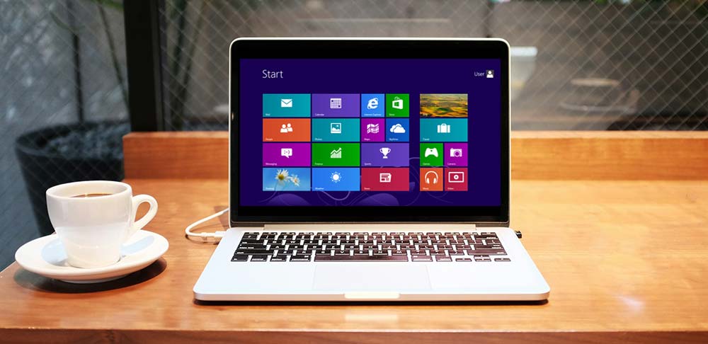
Microsoft’s Metro UI: Flat Gets Real
A major turning point in UI design came when Microsoft introduced Metro UI on Windows Phone 7. They took a radical approach by abandoning visual effects like shadows and gradients. Instead, Metro UI focused on typography, solid colors, and clean content layouts.
With content-first layouts and bold colors, the design created a more efficient user experience, especially on small screens. Metro UI proved that flat design could be a powerful strategy for improving usability.
Apple iOS 7: A Radical Shift to Flat
Not long after, Apple followed a similar path with the redesign of iOS 7. They moved away from skeuomorphic design in favor of a lighter look with simple icons, thin fonts, and transparent elements. The shift initially received criticism for being too drastic and unfamiliar. However, over time, users began to appreciate its simplicity.
Transparency and layering in iOS 7 also introduced a new way to deliver visual depth without relying on heavy 3D effects.
Google’s Material Design: Flat Meets Depth
Then came Google’s Material Design in 2014. While maintaining flat aesthetics, it added subtle shadows, meaningful animation, and principles of physicality to make UI elements feel more tangible.
This approach allowed Google to create a consistent design system across platforms, from web to mobile apps. Material Design also introduced new standards in color usage, iconography, and interactions, which were later adopted by many other design systems.
Flat design became the new foundation for building efficient, adaptive, and user-friendly interfaces.
2. Core Principles That Define Flat Design
Embracing Visual Simplicity
One of the greatest strengths of flat design lies in its visual simplicity. This design style features clean lines, basic shapes, and minimal visual elements. Not only does it create a more modern look, but it also helps users focus on the core content.
By removing unnecessary details like shadows, textures, or excessive animations, you can craft lighter and more intuitive interfaces. This principle is particularly effective for quickly and efficiently improving the user experience.
Typography-Driven Interfaces
In flat UI, typography is the foundation. You need to choose clean, legible sans-serif fonts. To create clear visual hierarchy, play with font size and weight so users immediately recognize what information is most important.
Bold and Purposeful Color Palettes
Color in flat design also serves as a visual navigation tool. Use bold, high-contrast, and limited color palettes. This will make UI elements more visible and interactive.
This keeps your design both functional and visually consistent.
Content Comes First: User-Centered Design
The final principle is placing content at the center. In content-first design, the interface should support the information, not distract from it.
Think: what is the user’s main goal? What do they need to see or do? Use clean layouts, clear navigation, and visual elements that support interaction, not just decoration.
3. Flat Design 2.0: The Evolution of Minimal UI
Flat Meets Function: The Rise of Near-Flat Design
As technology and user needs evolved, so did flat design, giving birth to Flat Design 2.0 or near-flat design. This style maintained visual simplicity but reintroduced subtle elements like light shadows, soft gradients, and shallow depth.
This wasn’t without reason. Many users had trouble distinguishing clickable elements in ultra-flat UIs. Near-flat design emerged as a solution to improve affordance and provide clearer visual cues.
Material Design’s Growing Complexity
One of the clearest examples of this evolution is Google’s Material Design. In its latest versions, Material Design introduced a more complex component system, including design tokens, cross-device responsiveness, and improved accessibility features like color contrast and animation controls.
This flexibility allows designers to build consistent UIs across platforms while preserving clean, lightweight flat principles.
Emerging UI Styles Beyond Flat
The evolution didn’t stop there. New styles like glassmorphism and neomorphism began to appear. While short-lived and more suited for visual experimentation, these styles show that designers continue exploring new ways to express dimension and aesthetics.
We’re also seeing trends like micro-interactions, smooth animations, and the integration of emerging tech like voice UI, AR/VR, and AI-driven interfaces, broadening the design landscape beyond flat visuals.

4. Flat Design’s Industry-Wide Impact
Aesthetic and Functional Standardization
One of flat design’s most significant impacts is the aesthetic and functional standardization across platforms. This design style has become the visual default in many digital interfaces. Even major companies like Google, Microsoft, and Shopify have integrated flat UI into their design systems, such as Material Design, Fluent Design, and Polaris.
This approach enables visual consistency that helps users adapt easily across different devices and applications.
Boosting Efficiency and Performance
Beyond visual benefits, flat design also brings technical advantages. Because it uses lighter graphical elements, it speeds up page load times and improves application performance.
Accessibility and Inclusive Design
High contrast, readable text, and intuitive navigation are principles that support all types of users. Flat design is also easier to adapt for screen readers and assistive tools.
Branding in the Flat Design Era
Lastly, flat design has influenced branding as well. Many modern logos have shifted to simpler, flatter forms, removing glossy effects and 3D treatments. This makes brands more recognizable across screen sizes and platforms while giving a sleek and professional impression.
5. Challenges and the Future of Flat Design
Early Criticisms of Flat Design
While flat design is praised for its simplicity, it hasn’t been without criticism. One major issue with early versions was the lack of visual cues, users struggled to distinguish clickable elements. As a result, many felt disoriented while navigating the interface.
Additionally, overly uniform flat UIs risk appearing monotonous and lacking personality. Many designers began to realize that excessive simplification could weaken both functionality and brand identity.
Finding the Balance: Simplicity vs Usability
That’s why it’s important to strike a balance between simplicity and usability. Adding subtle shadows, hover effects, or micro-interactions can help provide essential feedback without compromising flat aesthetics.
Flat Design with Brand Personality
Another challenge is maintaining brand uniqueness among homogeneous design trends. To overcome this, you can combine flat design principles with your brand’s unique visual elements, such as specific colors, illustration styles, or consistent tone of voice. This way, your design remains simple yet personal and distinct from competitors.
Looking Ahead: Future UI Design Trends
Looking forward, UI design will keep evolving. We’re starting to see voice UIs, flat overlays in AR/VR, and AI-personalized interfaces. There’s also a growing push for ethical and sustainable design practices, such as reducing digital footprints and building inclusivity into design from the start.
Conclusion: Evolving with Flat Design
The flat design trend has brought significant changes in how we design digital interfaces, from visual simplification to improved performance and accessibility. But like any trend, it continues to evolve.
From its roots in skeuomorphism to the rise of Flat 2.0, flat design has proven that simplicity can be incredibly effective, when applied with intention and care.


