Introduction to Figma: Why It’s Perfect for Web Design
Why Figma is the Right Tool for Web Design
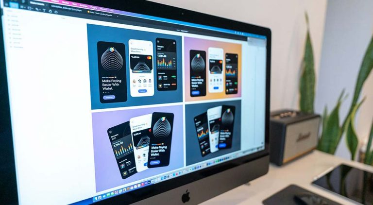
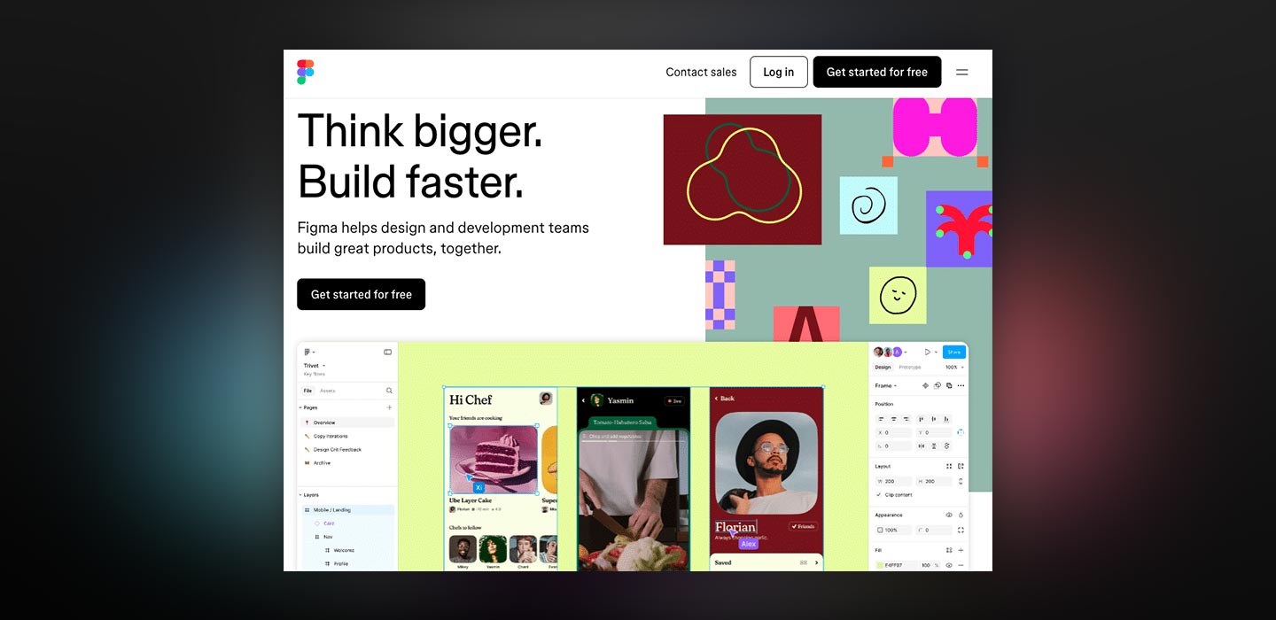
If you’re working on a web design project, you need the right design tool. And when it comes to modern, collaborative design tools, Figma has become a favorite among designers, developers, and even business owners. Why Figma? Because it simplifies the entire design process, from ideation to execution, without requiring any installation.
Figma is a cloud-based design platform that runs directly in your browser. That means you can access your work from any device, collaborate in real-time with your team, and never worry about file versions. Whether you’re designing a landing page, an app interface, or a full website layout, Figma gives you the flexibility to work efficiently and stay organized.
All-in-One Design Platform
At its core, Figma combines vector graphic editing features with tools for prototyping, animation, and design system management. You can draw shapes, arrange text, add interactions, and build reusable components, all in one place. Unlike traditional tools tied to a specific device or operating system, Figma works on Windows, macOS, and even Chromebooks.
Intuitive and Collaborative
Another reason Figma stands out is its intuitive interface. Even if you’re a beginner, you’ll feel comfortable navigating it. And if you’re working in a team, real-time collaboration features like multi-user editing and in-context comments can speed up your workflow. In short, Figma makes web design more accessible, collaborative, and enjoyable, making it a top choice for many startups and agencies.
Simply put, if you’re looking for a design tool that supports real-time collaboration, works across devices, and helps you stay organized from wireframe to handoff, Figma is the tool for you.
- Introduction to Figma: Why It’s Perfect for Web Design
- Mastering Figma: Core Tools and Concepts for Web Designers
- Essential Design Principles You Can Apply in Figma
- Building Design Systems and Components in Figma
- Prototyping in Figma: How to Bring Your Designs to Life
- Web Design Workflow Using Figma: From Idea to Final Handoff
- Team Collaboration and Developer Handoff in Figma
- Advanced Figma Techniques and Expert Tips
- Exporting Figma Designs and Integrating with Development Tools
- The Future of Web Design with Figma: Trends to Watch
1. Mastering Figma: Core Tools and Concepts for Web Designers
Once you understand the benefits of using Figma, the next step is to get familiar with its core tools and features. These are the foundations that will shape your web design process, from layout planning to adding interactivity. Luckily, Figma is designed to be easy to learn, even for beginners.
Frames: Your Digital Canvas
In Figma, frames work like artboards. You can create multiple frames for different screen sizes, such as desktop, tablet, or mobile. This helps you design and test responsive layouts from the start.
Shapes & Vectors: Drawing Made Simple
To design custom layouts or icons, you can use Figma’s vector tools like rectangles, circles, lines, and the pen tool. This allows you to draw precisely and manage paths flexibly, similar to professional vector software.
Text: Styling and Hierarchy
Figma offers complete typography controls, so you can easily manage headings, paragraphs, or buttons. You can adjust font size, weight, alignment, and more.
Images: Import, Crop, and Mask
You can drag and drop images directly into your design. Figma allows you to crop, resize, mask, or add effects, all within the app. This speeds up your workflow.
Layers: Stay Organized
As your design becomes more complex, keeping it organized is crucial. Figma uses a layer system that lets you group elements, rearrange them easily, and name layers clearly, especially helpful when working in teams.
Pages: Manage Multiple Views
For large projects, Figma lets you use multiple pages within a single file. You can separate wireframes, design versions, or different user flows while keeping everything tidy.
Plugins: Extend Your Capabilities
Figma supports various plugins to boost your productivity. Need free images? Try the Unsplash plugin. Need dummy data for mockups? Use Content Reel. Need icons? Iconify is your friend.
Widgets: Interactive Design Tools
Figma also offers widgets, interactive elements like timers, sticky notes, or voting tools, great for team brainstorming sessions.
Mastering these tools will help you work more efficiently in Figma. Once you’re familiar with them, turning ideas into interactive designs becomes much faster.
2. Essential Design Principles You Can Apply in Figma
Now that you’re familiar with Figma’s basic tools, it’s time to focus on how you actually design. Good design isn’t just about appearance. It’s about structure, clarity, and usability. By applying the right design principles in Figma, you can create websites that are both visually appealing and user-friendly.
Layout: Structure Comes First
Start with a solid layout. Use grids to define columns, rows, and margins. This helps your design feel balanced and consistent across different screens. Also take advantage of the Auto Layout feature, which allows elements to adjust their size automatically as content changes. It’s perfect for buttons, cards, or sections that need to grow or shrink dynamically.
Finally, use constraints to define how elements should behave when the screen resizes, whether they stay pinned to the top, center, or stretch with the frame.
Color: Create Harmony and Clarity
Color choices go beyond aesthetics. You need a consistent color system that can be reused throughout the project. Define clear primary, secondary, and accent palettes. Figma supports gradients and various fill types, adding depth to your design. Most importantly, always check contrast and accessibility. Make sure text remains legible on different backgrounds.
Typography: Guide the Reader’s Eye
Text plays a huge role in web design. In Figma, use text styles to define fonts, sizes, and weights consistently. This helps users quickly distinguish between headings and body content.
Try font pairing, but don’t overdo it. Two or three fonts are usually enough. Adjust line height and letter spacing for better readability, especially on smaller screens.
Imagery: Support, Don’t Distract
Images should support the design, not distract from it. Optimize image sizes to avoid slow loading, and use masking or overlays to better integrate visuals into your layout. Aim for visual consistency. Avoid mixing illustration styles or photo tones that clash. Always consider context. Does the image truly support the message you’re conveying?
Usability & Accessibility: Design for Everyone
Great-looking designs are useless if they’re not usable. Use clear navigation structures, write descriptive alt text for images, and support keyboard navigation where possible. Figma includes built-in tools to check contrast and readability. Use them to ensure your design is both usable and accessible.
3. Building Design Systems and Components in Figma
As your web design project grows, maintaining design consistency becomes more challenging. That’s where design systems come in. By adopting a component-based workflow in Figma, you can build a scalable design foundation, save time, and keep everything aligned, no matter how many pages or team members are involved.
Components: Reuse and Standardize
In Figma, you can convert any group of elements, like buttons or nav bars, into a component. Components act as reusable templates. When duplicated, they create “instances” that stay linked to the master component. The benefit? When you update the master, all instances update automatically. This saves time and prevents design inconsistencies.
Variants: Handle Interactive States
If you need a button with multiple states like hover, disabled, or active, use variants instead of creating separate components. Variants let you bundle different states into a single smart component, keeping your prototypes realistic and your files clean.
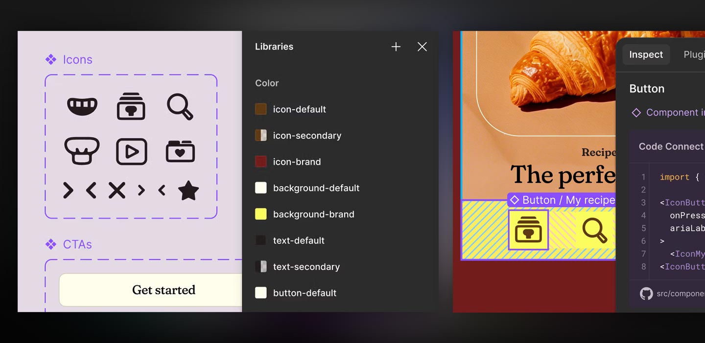
Styles and Tokens: Keep It Consistent
Figma allows you to create and reuse styles for color, typography, effects, and even grids. These styles act like design tokens, ensuring your visual identity stays consistent across all pages and team files. If you ever need to update brand colors or fonts, you can do it in one place, and the change will apply across the board.
Libraries: Share Across Projects and Teams
Once you build a solid design system, you can publish it as a library. This allows teammates, or even other teams, to access the components and styles you’ve created. It’s especially useful for large teams or organizations with multiple products. Figma also lets you control access, manage version updates, and track component usage.
Benefits of Design Systems: Why It Matters
Using a design system isn’t just about efficiency. It provides structure and clarity to your workflow.
- Consistency ensures the interface feels unified across pages.
- Efficiency speeds up the process by reducing repetitive tasks.
- Scalability makes it easier to expand or revise in the future.
- Collaboration improves because everyone uses the same design language.
If you want to design faster, smarter, and with fewer errors, start building components and design systems in Figma today.

4. Prototyping in Figma: How to Bring Your Designs to Life
Once you’ve created static layouts in Figma, the next step is to make them interactive. This is where prototyping comes in. With just a few simple steps, you can turn your designs into real user experiences.
Flows: Map the User Journey
Start by organizing your screens into clear flows. This helps you and your team understand how users will move from one step to the next, whether it’s onboarding or an e-commerce checkout. Flows add structure and simplify testing later.
Connections: Link Screens Together
To add interactivity, use connections between elements. Drag the blue arrow from one object to another frame, then define what happens next. This is the foundation of any Figma prototype.
Triggers and Actions: Add Real Interactivity
Figma supports various triggers like click, hover, button press, and key press. These triggers define the required user action. Pair them with actions like navigating to another frame, opening an overlay, or switching variants, and you’ll have a working prototype, without writing a single line of code.
Animations and Transitions: Make It Smooth
For a smoother experience, add transitions like dissolve, slide in, or smart animate. These effects make your prototype feel dynamic and responsive, like a real app or website. But use them wisely and avoid overloading your design.
Interactive Components: Save Time on Repetitive UI
Instead of linking every dropdown or toggle manually, create interactive components. These UI elements come with built-in behavior, perfect for menus, tabs, or elements with multiple states.
Presentation Mode: Share and Test
Once your prototype is ready, enable Presentation Mode to preview it. You can also share a link with your team or stakeholders for user testing. It’s a great way to gather feedback early, even before development starts.
5. Web Design Workflow Using Figma: From Idea to Final Handoff
A clear workflow helps you stay focused, communicate better with your team, and avoid unnecessary revisions. Figma is designed to support every step of this process, from research to developer handoff.
Discovery & Research: Understand Before You Design
Before you start designing, you need to understand user goals, create personas, and analyze competitors. Figma lets you organize all this visually with sticky notes, moodboards, or flowcharts, right inside your file.
Wireframing: Plan the Layout
Next, create low-fidelity wireframes to plan your site’s structure. Use simple shapes and placeholder text to focus on flow and layout, not visuals. It also helps stakeholders understand your ideas before diving into details.
UI Design: Bring It to Life
Once your wireframes are approved, it’s time for high-fidelity design. Apply your design element, such as colors, typography, spacing, and components. Using Figma’s styles and components keeps your work consistent and fast.
You can also design multiple page versions or create responsive designs using frames for different devices.
Prototyping: Make It Interactive
Once the UI is complete, turn static pages into interactive prototypes. Link screens, add interactions, and simulate real user flows.
User Testing: Validate with Real Feedback
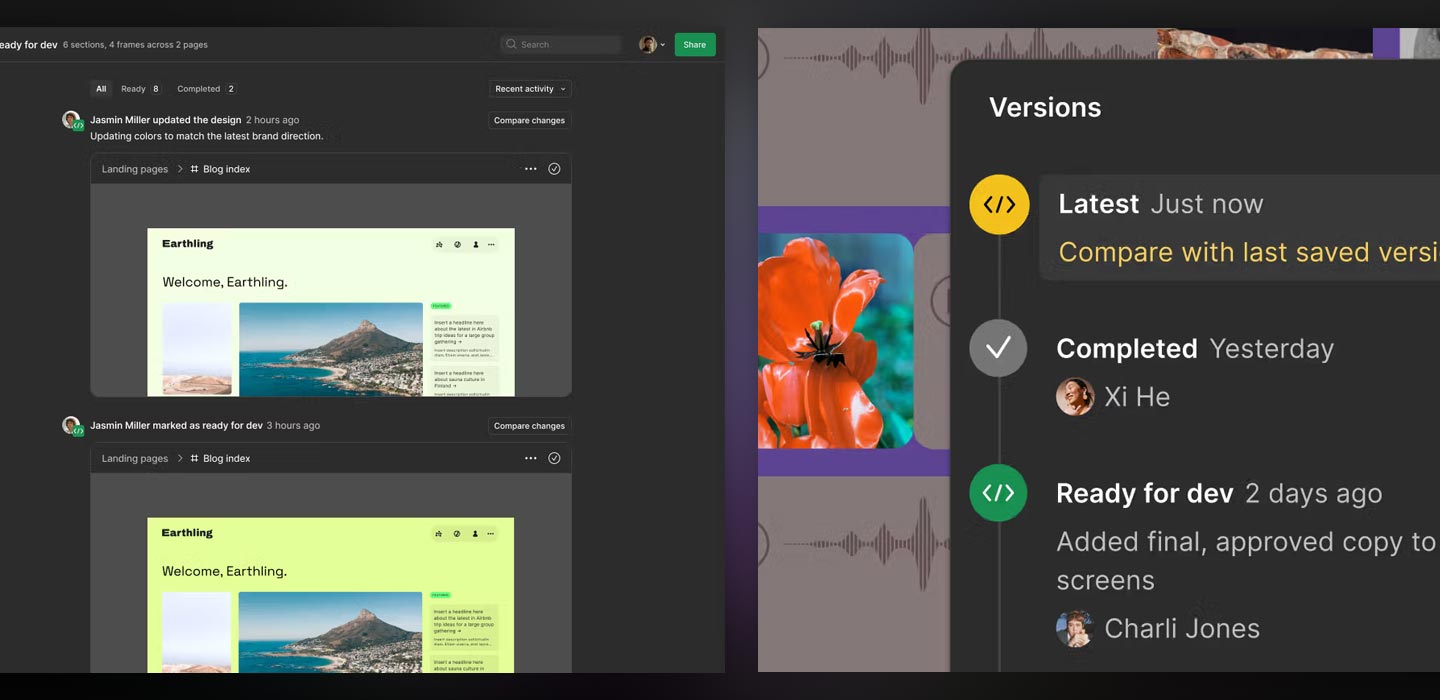
Use prototypes to run user testing, internally or with your target audience. Ask users to complete specific tasks, identify pain points, and gather insights. With built-in tools like comments and version history, you can make changes right inside Figma.
Developer Handoff: Get It Ready for Build
When the design is finalized, it’s time to hand off to developers. Figma’s Inspect Mode gives developers all the specs, spacing, colors, fonts, and downloadable assets, without needing separate documentation.
Iteration & Refinement: Keep Improving
After launch, keep iterating based on user feedback. Since all files are cloud-based, you can update and collaborate quickly. Easily revise components, adjust layouts, and sync changes across your design.
In conclusion, by following a structured workflow in Figma, you can streamline your design process, reduce costly revisions, and deliver visually compelling, functional projects.
6. Team Collaboration and Developer Handoff in Figma
Collaboration is key to building effective digital products, and the good news is, Figma was built for teamwork. It combines design, feedback, and developer handoff in a seamless workflow.
Real-Time Collaboration: Design Together
Unlike traditional tools, Figma allows multiple users to edit the same file simultaneously. This is especially useful for brainstorming, live reviews, or design sprints. No more sending files back and forth, everyone works from the same source.
Commenting System: Give Feedback in Context
Figma’s in-context commenting lets you give feedback directly on design elements. Comments can be replied to, resolved, or assigned to specific people, making discussions more structured and clear.
Version History: Track Every Change
Accidentally deleted something important? Don’t worry, Figma automatically saves every version of your file. You can view, compare, or revert to previous versions at any time. This is handy during experimentation or when reviewing iterations.
Sharing Options: Control Who Sees What
You can share Figma files via public or private links, and set permissions for viewing, commenting, or editing. This makes it easy to involve clients, stakeholders, or developers at every project stage.
Developer Handoff: Skip the Manual Specs
When it’s time to build, developers can switch to Inspect Mode. They’ll see specs like CSS, sizing, fonts, spacing, and can download assets, no extra handoff files needed. Figma also supports exporting images in formats like PNG, SVG, or PDF.
Annotations and Spacing Guides: Add Extra Clarity
To help developers fully understand your designs, add annotations and use spacing guides. Small details like these help reduce miscommunication and speed up implementation.
Figma makes team collaboration and developer handoff faster, easier, and more accurate. When everyone works in sync, from designer to developer, you can ship better products with fewer roadblocks.
7. Advanced Figma Techniques and Expert Tips
Once you’re comfortable with Figma’s basics, it’s time to level up. By mastering some advanced techniques, you can work faster, keep your files clean, and create more scalable designs. This section will help you streamline your workflow and elevate the quality of your output.
Plugins for Efficiency: Let Tools Do the Work
Figma has a vibrant plugin ecosystem. There are hundreds of free plugins that can save you tons of time. For example:
- Use Content Reel for dummy data
- Use Unsplash to import copyright-free images
- Use Iconify to access thousands of ready-to-use icons
The right plugins can massively boost your productivity.
Keyboard Shortcuts: Work Smarter, Not Harder
Many beginners rely on the mouse, but experienced designers know that keyboard shortcuts dramatically speed up workflows. Try T for text, R for rectangle, or Shift + A to activate Auto Layout instantly. Take the time to memorize your most-used shortcuts. They’ll save you hours.
Organization & Naming Conventions: Keep It Clean
A clean design needs a clean file structure. Name your layers clearly, group elements using frames or groups, and use sections to organize your work. Well-structured files help your team and make it easier to review, revise, or hand off designs.
Figma Community: Learn and Share
Don’t work alone. The Figma Community is full of designers sharing templates, UI kits, and ready-to-use components. You can clone files you admire, study how they’re built, and even contribute your own. It’s a great way to quickly build landing pages, dashboards, or entire design systems.
Design System Maintenance: Evolve with Your Product
If you’ve built a design system, keep it alive. Regularly audit components, update styles when needed, and remove unused elements. An up-to-date design system keeps your product agile and relevant.
Best Practices Summary: What Pros Always Do
To wrap up this section, here are a few habits you should adopt:
- Use Auto Layout for flexible design
- Build nested components for reusability
- Keep layers neat and structured
- Document design decisions for team reference
8. Exporting Figma Designs and Integrating with Development Tools
Once your design is complete and approved, the next step is integrating it into the development process. Figma offers several export and integration features that make it easy for developers to build your design into a real product.
Asset Export: Get the Right Files in the Right Format
Figma makes it simple to export visual assets like icons, illustrations, or images. Just mark the elements, choose the format, PNG, JPG, SVG, or PDF, and set the size.
Code Specs: Let Developers Inspect with Ease
With Inspect Mode, developers can see element sizes, spacing, colors, fonts, and CSS directly from Figma. All the technical details are accessible without writing separate documentation, just click an element, and the data is there.
Figma to Code Tools: Bridge the Gap
For more integrated workflows, you can use third-party tools that connect Figma to code:
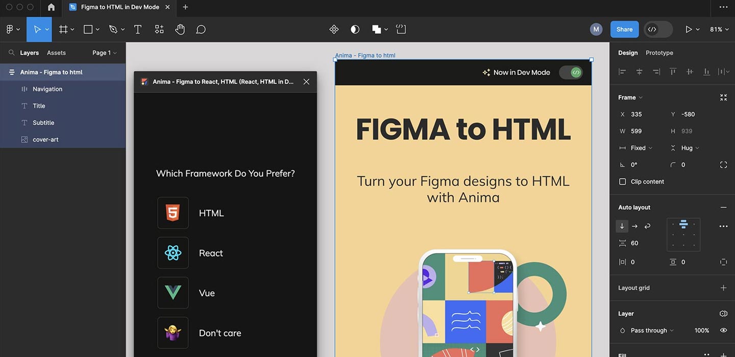
- Anima – converts designs to responsive HTML/CSS
- Framer – design and directly build interactive websites
- Zeplin – syncs with Figma and developer tools for clean handoff
These tools speed up production and help ensure your designs are implemented accurately.
Design Tokens: Sync Styles with Real Code
For large teams or complex design systems, you can export design tokens from Figma to JSON, SCSS, or CSS. This ensures your design’s visual styles match what’s implemented in the frontend.
Dev Mode: Tailored Experience for Developers
Figma also offers Dev Mode, a view tailored specifically for developers. It shows only the technical data they need, keeping the interface clean and focused. With Dev Mode, development becomes faster, clearer, and less error-prone.
9. The Future of Web Design with Figma: Trends to Watch
Web design continues to evolve, and so does Figma. As technology advances and teams become more collaborative, the way we design is changing too. To stay relevant as a designer, it’s important to watch emerging trends and evolving standards in the Figma ecosystem.
AI-Powered Design Tools: Smarter, Faster Workflows
One of the most exciting trends is AI in design. Figma is beginning to introduce AI-powered features like auto layout suggestions, color recommendations, and even auto-generated content. With AI support, you can make design decisions faster and more efficiently.
Motion Design and Microinteractions: More Engaging Interfaces
Static designs are no longer enough. Today’s users expect responsive, “alive” interfaces. Figma lets you create microinteractions and animated prototypes directly in your design file, perfect for showing transitions, hover effects, or visual feedback.
No-Code and Low-Code Integration: From Design to Deployment
More and more tools now support direct integration from Figma to no-code platforms like Webflow, Framer, or Bravo Studio. This means you can turn your designs into publishable websites, without writing a single line of code. It’s a game-changer for freelancers, indie designers, or small teams.
Responsive Prototyping: Beyond Fixed Breakpoints
Responsive design is no longer just about desktop vs. mobile. Figma now supports new approaches to responsive prototyping using features like Auto Layout and fluid resizing, letting you test your designs across screen sizes without duplicating frames.
Cross-Functional Team Collaboration: All-in-One Workspace
Another major trend is how Figma is being used by entire cross-functional teams, not just designers. Developers, marketers, and product managers all contribute to Figma files by commenting, checking specs, and accessing assets. This accelerates production and reduces miscommunication across departments.
In conclusion, Figma isn’t just keeping up with the future of design. It’s helping shape it. By embracing new features and trends, you can sharpen your skills and bring even more value to every design project you take on.