What is Infographic Design? Definition, Purpose, and Benefits
Definition and Meaning of Infographics
Infographic design is the process of conveying complex information in an engaging and easy-to-understand visual format. This design typically combines short text, graphics, icons, and other visual elements into a clear composition. The goal is to help the audience quickly grasp the message without having to read too much text.
Why Use Infographics? Key Purposes and Benefits
Using infographic design is very helpful for simplifying data, especially when you need to explain something complex to a general audience. It speeds up audience comprehension, enhances visual appeal, and makes your message more memorable. Infographics are highly effective on social media due to their shareable nature and ability to grab attention. In a business context, you can also use them to strengthen your brand image and demonstrate professionalism. In short, infographic design is a visual tool that can enhance communication, accelerate understanding, and build a stronger connection with your audience.
- 1. What is Infographic Design? Definition, Purpose, and Benefits
- Popular Types of Infographics and When to Use Them
- Essential Design Principles for Effective Infographics
- Core Design Elements in Infographics
- Step-by-Step Infographic Design Process
- Recommended Tools and Resources for Infographic Designers
- Best Practices for Creating Impactful Infographics
- Common Challenges in Infographic Design and How to Overcome Them

1. Popular Types of Infographics and When to Use Them
Data-Driven and Statistical Infographics
If you want to present numbers, survey results, or trends in a visual format, statistical infographics are the right choice. This type typically uses bar charts, pie charts, or line graphs to deliver data in a direct and easy-to-understand way.
Timeline and Process Infographics
To explain a sequence of events or steps in a process, you can use timeline or process infographics. These graphics are perfect for illustrating a company’s history, project phases, or workflows.
Geographic, Hierarchical, and Comparison Infographics
Geographic infographics are used when presenting location-based data, such as distribution maps. Hierarchical infographics depict structures like organizational charts or levels. If you want to show the differences between two things, comparison infographics are ideal.
List-Based, Resume, and Informational Infographics
List infographics organize key points in a format that’s easy to follow. Resume infographics are great for showcasing experience and skills visually. Meanwhile, informational infographics help explain concepts or topics using icons and short text.
Each type of infographic design serves a specific function. Choose the one that best fits your message and audience to make communication more effective and engaging.
2. Essential Design Principles for Effective Infographics
Clarity, Accuracy, and Simplicity
When creating infographic design, the first thing you need to maintain is clarity. The information you present should be instantly understandable without extra explanation. One of the most common mistakes is oversimplifying data to the point of inaccuracy. Use reliable data and present it in a simple way.
Visual Hierarchy and Balance
To guide your audience on where to start reading, you need to build a clear visual hierarchy. Use font size, color, and element placement to direct attention. Don’t forget to maintain balance, both visually and in content, so your infographic feels neat and well-structured.
Consistency, Engagement, and Readability
Use a consistent design style, including colors, icons, and fonts. This builds a professional impression and reinforces your brand image. Then, make the design visually appealing while keeping it easy to read. Avoid too many visual elements that might distract the audience from the data presentation.
By following these principles, you can create infographic designs that are effective, informative, and visually engaging.
3. Core Design Elements in Infographics
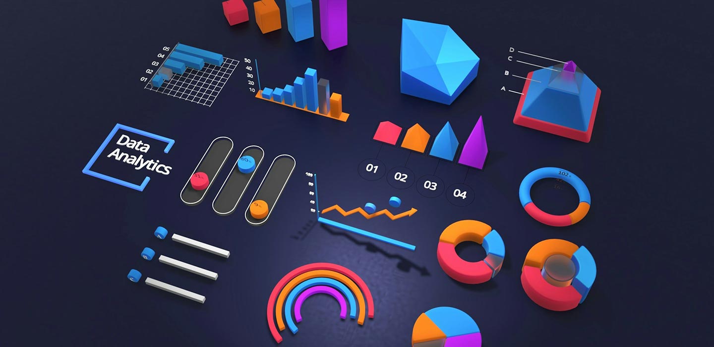
Visualizing Data: Charts, Maps, and Diagrams
In infographic design, data visualization is a key element. You can use various types of charts like bar charts, pie charts, or line graphs to present numbers. For location data, use maps. Meanwhile, diagrams or flowcharts are perfect for explaining processes or relationships between elements.
Typography: Choosing and Styling Fonts
Font choice has a strong impact on readability. Use no more than two font families, and be sure to apply a clear hierarchy between titles, subtitles, and body text. This helps the audience easily follow the flow of information.
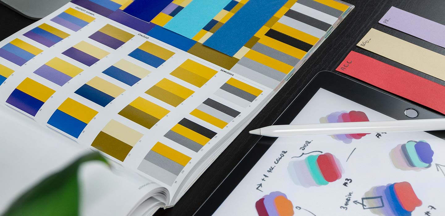
Colors and Accessibility: Creating a Harmonious Palette
Colors not only make infographics attractive but also help convey meaning. Use a harmonious color palette and ensure high contrast so it’s readable for everyone, including those with color vision limitations.
Icons and Imagery: Supporting Content Visually
Choose icons and images that are relevant, simple, and stylistically consistent. Their purpose is to support the content, not to distract from the main message or key data being presented.
Layout and Composition Techniques
Use grids to maintain structure, and guide the reader’s eye. Don’t forget white space to give the design breathing room and avoid a cluttered appearance.
4. Step-by-Step Infographic Design Process
Define Your Goals and Target Audience
The first step in creating infographic design is to define a clear goal and identify your target audience. Are you aiming to educate, promote, or simply share important data? Understanding your audience helps you choose the right visual style and communication approach.
Research and Gather Accurate Data
Next, conduct research to gather data from credible sources like government agencies, journals, or trusted statistical platforms. Avoid unverified information as it can damage your audience’s trust.
Outline, Sketch, and Choose Infographic Type
Before you begin designing, create an outline or rough sketch. Define the story flow, information sequence, and choose the most suitable infographic type, like a timeline, list, or comparison.
Start Designing: Tools, Layouts, and Visuals
Use tools like Canva, Figma, or Illustrator to begin designing. Apply design principles such as visual hierarchy, element balance, and effective color use.
Write Concise and Effective Copy
Use short yet powerful text. Titles and subtitles should grab attention, while the main content should support visuals with simple, easy-to-understand language.
Review, Iterate, and Optimize
Before publishing, make sure all elements work harmoniously. Double-check data, test readability, and ask for feedback if needed. Finally, adjust the format to suit different platforms. By following this process, you can create infographic designs that are structured, informative, and effective for various purposes.
5. Recommended Tools and Resources for Infographic Designers
Design Software and Platforms
To create professional infographic designs, you need the right software. Tools like Canva, Adobe Illustrator, and Figma are popular because they offer ready-to-use templates and intuitive design features. If you want more flexible and customizable designs, Adobe Illustrator and Figma offer more detailed control. Meanwhile, Canva is ideal for beginners who need quick results.
Research and Data Sources
Strong data is the foundation of a convincing infographic. Use trusted sources like Statista, the World Bank, or government agencies like BPS. You can also refer to academic journals or official reports from reputable media to ensure the information you present is valid and accountable.
Icon and Image Libraries
To make your design visually appealing and consistent, use icons and images from platforms like Flaticon, The Noun Project, Freepik, or Unsplash. Choose visual elements that are relevant and stylistically uniform to ensure your design looks professional and is easy to understand.
With the right tools and resources, you can create infographic designs that are not only engaging but also credible and functional.
6. Best Practices for Creating Impactful Infographics
Keep It Focused and Simple
One of the key principles in infographic design is maintaining a focused message. Don’t cram in too much information at once. Choose one main topic and ensure all visual and textual elements support that core message. Simplicity will help the audience absorb the content more quickly.
Prioritize Readability and Accessibility
Ensure that all text in your infographic is easy to read on both desktop and mobile devices. Use sufficient color contrast, appropriate font sizes, and avoid overly busy backgrounds. Additionally, it’s important to consider accessibility for all users, including those with color vision deficiencies.
Optimize for Sharing and Branding
To make your infographic easily shareable, create versions tailored for different platforms such as Instagram, LinkedIn, or blogs. Add your logo and visual identity elements to maintain brand consistency. An attractive title can also boost shareability on social media. By following these tips, you’ll create infographic designs that are not only visually appealing but also effective in delivering messages and expanding your audience reach.

7. Common Challenges in Infographic Design and How to Overcome Them
Misrepresentation and Oversimplification of Data
One of the main challenges in infographic design is simplifying data without compromising accuracy. Sometimes, in the pursuit of simplicity, the data becomes misleading. The solution is to fully understand the context of the data and present the information honestly, even if it means providing a bit more explanation.
Visual Inconsistencies and Accessibility Issues
Using inconsistent icons, colors, or fonts can disrupt the visual flow and reduce the design’s credibility. Many designers also overlook accessibility aspects, such as color contrast or text size. To avoid this, always follow consistent design guidelines and test your final design on multiple devices.
Mobile Responsiveness and Reader Flow Problems
Many infographics look great on desktop but fall apart on mobile devices. Make sure your design is responsive, with elements that adapt to different screen sizes. Also, pay attention to visual hierarchy so that the reader’s eyes can follow the flow of information smoothly from start to finish. Overcoming these challenges will help you create infographic designs that are not only visually appealing but also effective, accurate, and inclusive.