What is a Pitch Deck and Why It Matters
Definition and Core Function
You’ve probably heard the term “pitch deck,” especially in the context of startups or business presentations. But what exactly is a pitch deck? Simply put, a pitch deck is a visual presentation used to explain your business idea in a concise, clear, and convincing way. It’s commonly used when you’re looking for funding, building partnerships, or introducing a new product to potential investors.
The function of a pitch deck is to serve as the main communication tool that shows the value of your business. This presentation helps you summarize your vision, the problem you’re solving, the solution you’re offering, and the size of the market opportunity you’re targeting.
Purpose and Goals
The main goal of a pitch deck design is to convince your audience that your business is worth supporting, whether through funding or collaboration. You need to show that your idea has potential, your team is solid, and your strategy is clear. It’s also a way to build credibility, which is crucial in today’s competitive business landscape.
Target Audience of a Pitch Deck
You need to know who will see your pitch deck. The primary audience is usually investors, such as venture capitalists and angel investors. But it doesn’t stop there, a pitch deck can also be presented to potential co-founders, key team members, or strategic partners who can help accelerate your growth.
That’s why it’s essential to create a pitch deck that’s not only visually appealing but also tells your business story in a powerful way. Start by understanding the goal, the audience, and the message you want to deliver most clearly.
1. Key Elements of a Successful Pitch Deck
Introduction Slide
Every effective pitch deck begins with a strong first impression. The first slide typically includes your company name, logo, and a tagline that reflects your brand identity. This part of the design should express professionalism and uniqueness. Don’t forget to use visual elements like your brand colors and consistent typography so your audience immediately recognizes who you are and what you stand for.
Problem and Solution Slides
After the introduction, you need to present the core problem your market faces. Use data, or relatable narratives to highlight the problem’s urgency. Then, in the following slide, showcase your product or service as the “hero” that solves that problem. Show how your solution is effective and truly relevant to market needs.
Market Opportunity and Product Showcase
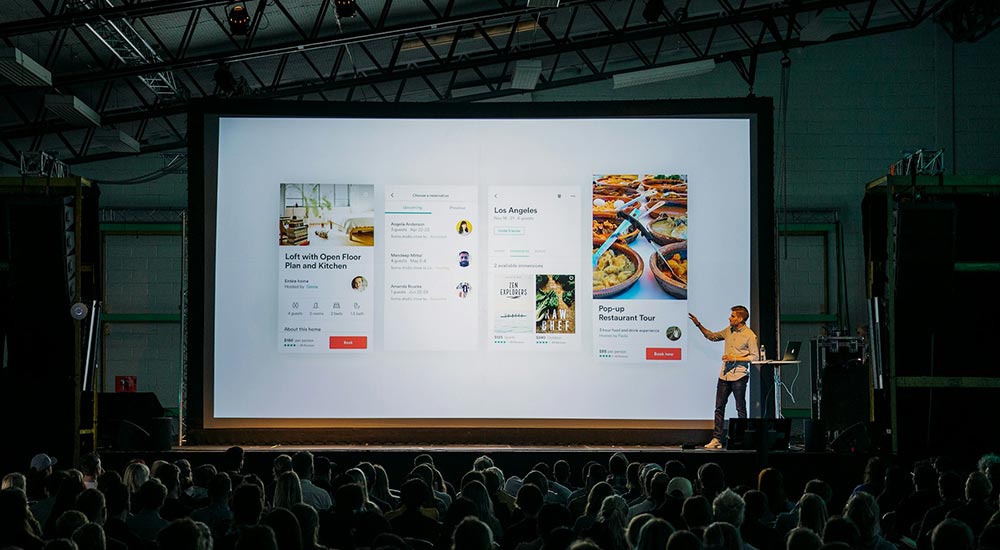
The next step is to prove that you’re operating in a large and growing market. Describe your target audience and how you plan to reach them. Then visually present your product. This could include screenshots, demos, or illustrated features. At this point, the pitch deck design should highlight UX and the user-perceived value.
By arranging your slides in this way, you guide your audience through the problem, solution, and business potential in a clear structure.
2. How to Craft a Compelling Pitch Deck Story
The Narrative Arc in Pitch Decks
A great pitch deck must carry a story. You need to build a narrative arc that helps your audience naturally and emotionally understand your business idea. Start with The Hook, a compelling opening, such as a surprising statistic or a brief, relatable story that illustrates the core problem. This grabs attention right away.
Then continue with the Rising Action, where you present the problem and build urgency. At the Climax, introduce your solution as the turning point of the story. Show how your product or service is the answer. Finish with Falling Action and Resolution, which include your business strategy and the ask, your funding request and vision for the future.
Using Storytelling Techniques
To strengthen your pitch deck storytelling, apply classic storytelling techniques: make your customer the hero, the problem the villain, and your solution the bridge to the “promised land.” Add emotional elements such as user stories, founder challenges, or personal insights. This helps the audience connect with you and believe that you truly understand their needs.
So, don’t just present information. Build a story that makes the audience feel like they’re part of your journey. With a strong storytelling approach, you’ll explain your business while inspiring support.
3. Visual Design Tips for Pitch Decks
Design Consistency
Use the same colors, fonts, and brand elements across all slides. This helps build a strong visual identity and makes your presentation look professional. Also, keep the layout consistent from slide to slide. Use a grid or layout system so your audience isn’t distracted by unnecessary visual shifts.
Clarity and Simplicity
Avoid crowding slides with too much text or graphics. Focus on one main idea per slide. Use short, clear bullet points so your information is easy to digest quickly. By simplifying your content, you help your audience stay focused on your core message.
Typography and Visual Hierarchy
Use large, readable fonts with high contrast against the background. Limit yourself to two or three font types, any more will disrupt design consistency. Organize visual elements by hierarchy: use size, color, and position to prioritize information, big title at the top, bolded key points, and supporting visuals at the bottom.
White Space and Visual Elements
Don’t be afraid of white space around text and images. It actually improves readability. Add high-quality visuals like custom icons, branded illustrations, or data charts.
4. Best Tools to Design a Pitch Deck
Presentation Software
To create a compelling and professional pitch deck, choose a presentation platform that fits your workflow. Popular options include Google Slides, PowerPoint, and Apple Keynote. Each has its strengths. Google Slides is great for online collaboration, PowerPoint is feature-rich and familiar, and Keynote offers smooth transitions and Apple’s signature elegant design.
Design Platforms
If you want a more creative visual result, try design platforms like Figma, Canva, or Adobe tools like Illustrator and InDesign. Figma is ideal for UI/UX designers familiar with grid systems and real-time collaboration. Canva is perfect for non-designers, offering many ready-made pitch deck design templates. Adobe tools provide full design flexibility for expert-level customization.
AI-Powered Tools
There are also AI-powered platforms that streamline the pitch deck creation process. Tools like Beautiful.ai, Pitch.com, Tome, and Gamma help you automatically apply good design principles, offering clean layouts that are quick to adjust. These are especially helpful if you want to focus on content without fussing over every visual detail.
5. Pro Tips to Make Your Pitch Deck Stand Out
Optimal Slide Count & Focus
A common mistake is making a pitch deck too long and full of technical details. But investors or partners have limited time to grasp your idea. Ideally, keep your pitch deck between 10 to 15 slides. Focus the content on what truly matters: the problem, your solution, the market, and your growth strategy. Avoid deep technical explanations unless they are absolutely necessary.
Tailor to Your Audience
Every audience has different expectations and backgrounds. So, make sure your pitch deck content is tailored to who will be seeing it. If you’re presenting to early-stage investors, they’ll want to hear about market size, growth potential, and your team’s strength. For strategic partners, emphasize product advantages and collaboration opportunities.
Visuals that Support, Not Distract
Use graphics, illustrations, and visuals to reinforce your message, not just for decoration. Well-placed visuals help audiences grasp data or processes faster. But keep them simple and ensure they don’t overshadow your core message.
Practice Your Delivery
Finally, don’t just rely on the slides. You also need to be confident in your delivery. Practice helps you organize your thoughts, manage timing, and avoid confusion when presenting.

6. Common Pitch Deck Mistakes to Avoid
Design and Readability Issues
One of the most common pitch deck mistakes is poor visual design or hard-to-read content. For example, too much text on one slide, small fonts, or low-contrast colors. These will quickly lose your audience’s attention. Keep your design clean, neat, and easy to scan. Use white space wisely, and make sure every visual element has a clear purpose.
Weak Narrative or No Hook
Beyond looks, the story you tell matters just as much. Many presentations fall flat because they lack a clear narrative or compelling opening. Don’t jump straight into the data, start with a hook that piques curiosity. Without a strong narrative, your pitch deck will feel flat and forgettable.
Unrealistic Financials
Another common error is presenting overly ambitious financial projections without reasonable justification. For instance, overly high revenue growth or unrealistic profit margins. This can raise skepticism from investors. If you include financial data, be ready to explain the logic and assumptions behind the numbers in a simple, transparent way.
Missing or Vague Ask
Lastly, many people forget to clearly state the ask, how much funding you need and how you plan to use it. This is a crucial part that should never be skipped. Don’t make your audience guess, state your request with confidence and transparency.
Conclusion: Start Designing a Pitch Deck That Wins Attention
Now you have a complete guide to building a strong pitch deck, from content structure and narrative flow to compelling visual design. Start crafting your first pitch deck using the principles above. Focus on a powerful story, clean design, and a clear message that sticks.


