Understanding Call to Action (CTA): Fundamentals and Formats
What is a CTA and Why It Matters
A Call to Action (CTA) is a crucial design element aimed at encouraging users to take a specific action, such as purchasing a product, signing up, or downloading something. It’s essential to understand that the primary goal of a CTA is to direct the user’s attention so they know exactly what to do next.
A well-crafted CTA can transform passive visitors into active users. For instance, buttons like “Buy Now” or “Subscribe” serve both as cues and as urgency triggers. That’s why it’s important to choose strong verbs and align the action with the user’s intent.
Common Types of CTAs to Use in Your Strategy
In practice, there are various types of CTAs you can use depending on your goals and context. You can choose between a primary CTA (focusing on the main action like “Get Started”) and a secondary CTA (providing alternatives like “Learn More”).
In terms of form, CTAs can appear as text links, large buttons, promotional banners, or visual icons. Some take the shape of pop-ups, sticky CTAs that remain visible while scrolling, or embedded elements within the content. These variations offer flexibility to place CTAs in the most strategic locations.
Key Components of an Effective CTA Design
To be effective, a CTA must clearly communicate its value. Use short but powerful messaging, and make sure the visual stands out through strong color contrast and visual hierarchy. For example, a brightly colored button with the text “Claim Your Offer” will more likely grab attention.
You can enhance appeal with supporting icons or microinteractions, such as hover animations. If appropriate, add urgency with limited-time offers or restricted availability messaging.

1. Strategic CTA Placement: Mapping User Behavior and Intent
Aligning CTAs with the User Journey
To place CTAs effectively, you need to understand the user journey, which tracks users from the initial stage to the decision-making stage. Each stage, awareness, consideration, and decision, requires a different CTA approach. For example, in the awareness stage, CTAs like “Learn More” or “See How It Works” are suitable. In the decision stage, “Buy Now” or “Start Free Trial” becomes more relevant as users are ready to act.
Analyzing User Flow to Determine Optimal CTA Spots
Besides understanding the journey, it’s important to analyze how users navigate your website or app. Use tools like heatmaps to see where users pause, read, or click. From there, you can identify strategic locations for placing CTAs, like after a product description or at the end of a blog post. This increases conversion rates by positioning CTAs at the moment users need a push.
Designing Responsive CTAs for All Devices
Make sure your CTA performs well across all devices. Mobile users tend to scroll faster, so your CTA should be clearly visible and easily tappable. Use adequately sized buttons, strong color contrast, and avoid placing CTAs too close to other elements.
Leveraging Psychology to Influence CTA Effectiveness
Lastly, you can optimize CTAs using psychological tactics. Add urgency like “Limited Offer” or “Only 3 Spots Left” to trigger fast action. Include social proof like testimonials near the CTA or partner logos to boost credibility. These psychological elements have proven effective in influencing user decisions.
2. Best Places to Put Your CTA: High-Impact Zones and Tips
Above the Fold: Immediate Visibility for High-Impact CTAs
Placing CTAs “above the fold”, the part of the screen users see without scrolling, is a classic and still effective strategy. This area is ideal for primary actions like “Get Started” or “Buy Now.” Make sure the CTA stands out visually and doesn’t get lost among other design elements.
In-Content CTAs: Seamless and Contextual Engagement
While users are reading blog posts or product features, you can embed CTAs mid-content to reinforce relevance. For example, after explaining a feature’s benefits, include a CTA like “Download the Guide” or “Read Case Study.” This approach feels natural and doesn’t disrupt the reading flow.
Sidebar and Sticky CTAs: Persistent Conversion Tools
Sidebars or sticky elements allow CTAs to remain visible while users scroll. These are great for secondary actions like “Subscribe to Newsletter” or “Follow Us.” However, ensure they don’t interfere with the user experience. Pay attention to size and placement for comfort.
Pop-Ups and Overlays: Timed or Behavior-Based Triggers
Pop-up CTAs can be highly effective when used wisely. For instance, trigger a pop-up when users are about to exit the page (exit-intent), or after they scroll 50% of the content. CTAs like “Get 10% Off” or “Join Our Community” work well here. Just don’t overdo it, too many pop-ups can harm the user experience.
Footer and End-of-Page CTAs: Re-Engagement After Content
The footer is a great spot for lower-priority but still important CTAs like “Contact Us” or “Privacy Policy.” Meanwhile, CTAs at the end of content can be used for re-engagement, such as “Start Free Trial” or “Read More Articles.” Since users have finished consuming content, this is the perfect moment to encourage action.
CTA placement plays a big role in its success. Combine multiple zones strategically, and ensure every CTA appears at the right time within the user’s journey.
3. Optimizing CTA Performance: Data-Driven Tactics
A/B Testing Your CTA Design and Copy
To find out which CTA works best, conduct A/B testing. This method lets you compare two variations, such as position, button color, or copy style like “Get Started” vs. “Try Free.” The results will show which version delivers a higher click-through rate. Test one variable at a time for clearer analysis.
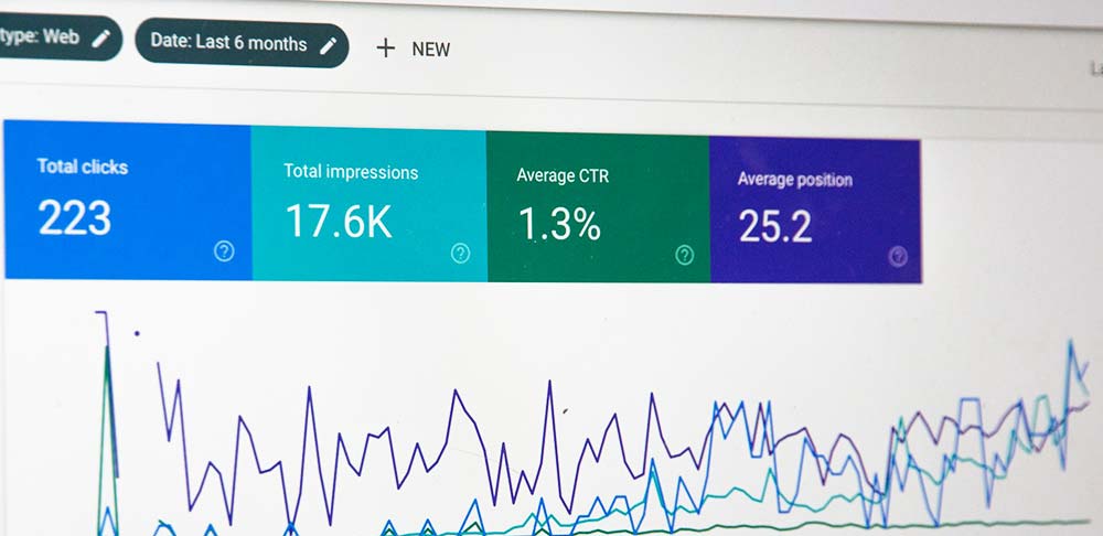
Using Heatmaps and Behavior Analytics
To understand user interaction, use tools like Hotjar or Crazy Egg. Heatmaps show which areas get the most clicks or attention. If users stop scrolling before reaching your CTA, you may need to reposition it. Scroll tracking also shows how far users navigate your page before acting.
Personalizing CTAs Based on User Segments
Not all users come with the same intent. Personalizing CTAs can boost performance. Show different CTAs for new and returning visitors, new users might see “Create Your Free Account,” while returning users see “Upgrade Now.” Personalization can also be based on location or past website behavior.
Optimizing CTA performance is an ongoing process. Use real data to make smarter design decisions and adapt your strategy to real user behavior.
4. Measuring CTA Success and Iterating for Better Results
Key Metrics to Track CTA Effectiveness
To evaluate your CTA’s success, monitor key metrics. The most common is click-through rate (CTR), the number of users who click versus those who see it. Also watch the conversion rate, or how many users take action after clicking, like signing up or purchasing.
Other valuable metrics include bounce rate and scroll depth. Bounce rate tells you how many users leave without interacting, while scroll depth shows how far they browse the page. If your CTA is placed low but scroll depth is shallow, it’s likely being missed.
Tools to Monitor CTA and User Interaction
Several tools help you track CTA performance. Google Analytics can monitor clicks and conversions. For behavioral insights, use heatmaps like Hotjar or Crazy Egg. If you want to run deeper experiments, Optimizely or VWO are excellent for systematic A/B testing.
Continuous Improvement: Review, Refine, Repeat
Regularly evaluate your CTA performance and adjust accordingly. You may need to change the text, button color, or position to improve effectiveness. Stay updated on design trends and ensure your CTA aligns with modern user experience standards.
Conclusion: Start Placing CTAs with Purpose and Precision
Now that you’ve learned all the strategies and best practices for CTA placement, it’s time to apply them with intent. Don’t just place buttons randomly, think about why the user should take action, when is the right time to ask, and where is the most effective place to display it.
A Call to Action bridges the gap between user intent and your business goal. Strategic placement boosts conversion rates, enhances the user experience, and makes navigation feel more intuitive.
Start by creating several CTA variations, test them, and use real data to continuously improve your strategy.


